Design system
Tokens, classes, fonts, and responsive breakpoints.
The design system keeps a site coherent. It stores shared colors, typography, classes, animation tokens, and responsive choices so repeated decisions do not become one-off overrides.
Tokens
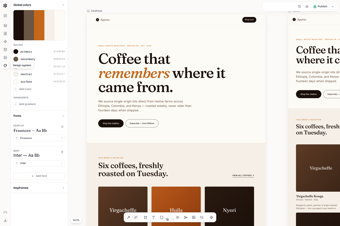
Use tokens for values that should repeat across a site: brand colors, surface colors, text colors, fonts, gradients, shadows, and keyframes. A token gives the value a name. Nodes can reference that name instead of hard-coding a hex value or font stack in every section.
Tokens are most useful when the brand changes. If the primary color is a token, you update it once and every section that references it follows.
Fonts
Mini Agency supports document fonts through the site design system. Choose a small set: one body font, one display font when the brand needs it, and one mono font only when code or technical data needs mono. Avoid assigning a new font to every section. Font changes should reinforce hierarchy, not create noise.
Site classes
Classes are reusable style groups for nodes. Use them for buttons, cards, badges, nav links, section wrappers, and repeated text treatments. A class is better than copy-pasting the same styles across many nodes.
A practical class set for a new site might include:
- btn-primary
- btn-secondary
- card
- section
- eyebrow
- nav-link
- form-field
Keep class names semantic. Name them by role, not by the current color. Use btn-primary instead of blue-button.
Breakpoints
Desktop is the master. Tablet and mobile can override styles where needed. The goal is not to duplicate the whole design system per breakpoint. The goal is to make the few changes that preserve readability and interaction.
Common mobile overrides:
- Section padding becomes smaller.
- Multi-column grids stack.
- Hero headings reduce in size and line height.
- Navigation becomes a menu or simpler stack.
- Wide cards become full-width rows.
State styles and animations
Hover, focus, active, and animation styles should be attached deliberately. Buttons need focus-visible states. Cards can use hover when they are clickable. Decorative animation should not distract from editing or reading.
When a motion pattern repeats, define it once as an animation token and reuse it. That keeps timing consistent across the site.
Design-system checklist
- Brand colors are tokens.
- Body and display fonts are set once.
- Buttons use classes.
- Repeated cards use classes or components.
- Breakpoint overrides are minimal and readable.
- Focus states are visible for keyboard users.