The editor
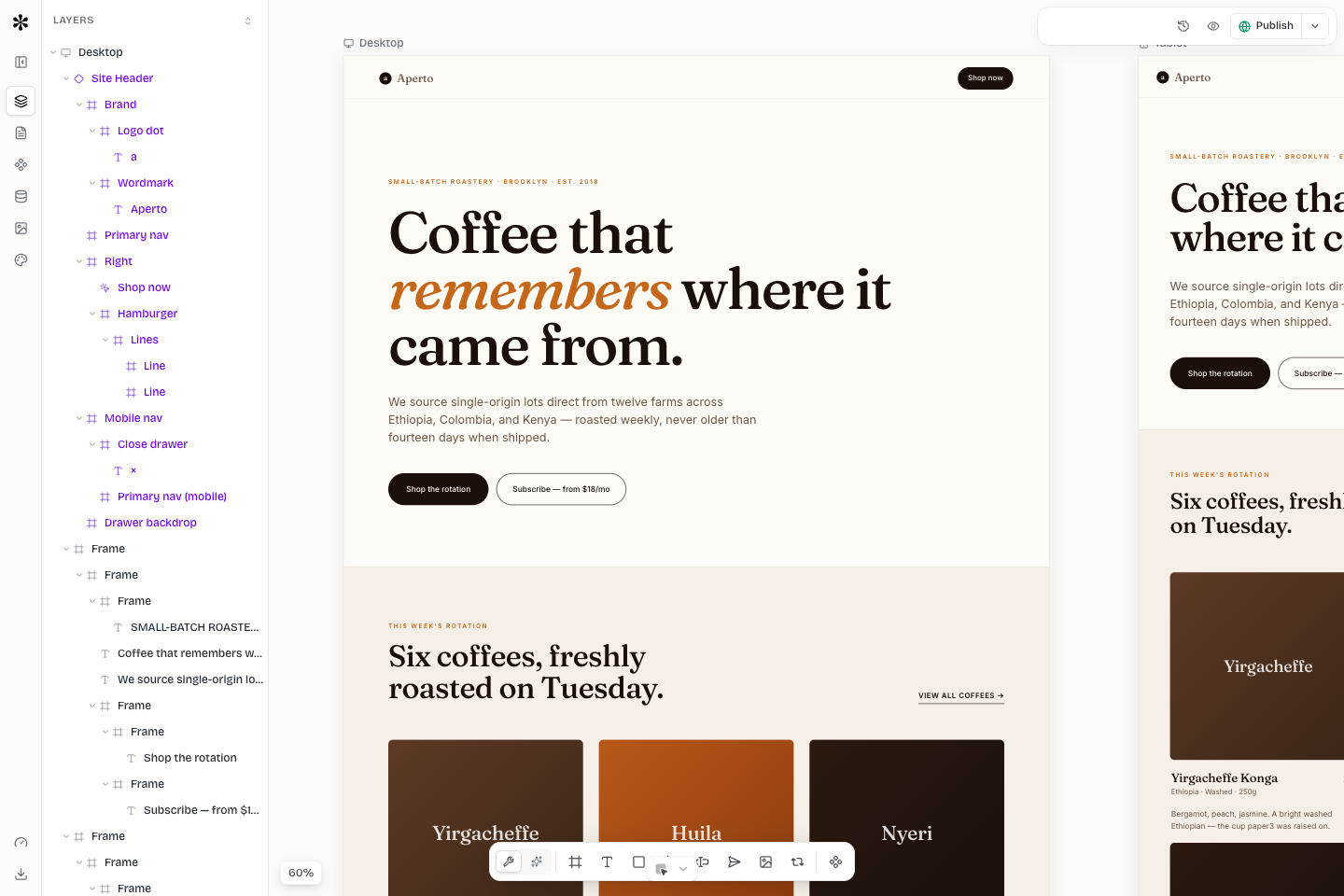
Canvas, nodes, layers, and the properties panel.
The editor is where the Mini Agency document becomes a real page. It is not a static mockup tool: each edit updates the same document that feeds preview, staging, publishing, AI agents, and MCP tools.
Main areas
The editor has four core areas.
The top toolbar controls navigation, undo and redo, breakpoint preview, focus mode, publish access, and app-level actions. The logo menu contains secondary commands that do not need a permanent toolbar slot.
The left rail exposes the page structure, layers, insert tools, reusable components, templates, media, and content-related panels. Use it when you need to find an element by hierarchy or add something new.
The center canvas renders the selected page or component. Click a node to select it, drag supported elements to move them, and use breakpoint controls to review responsive variants.
The right rail is the properties panel. It edits the selected node: layout, size, position, spacing, typography, fills, borders, effects, behavior, form settings, image source, and content bindings.
Nodes and hierarchy
Mini Agency stores pages as a typed node tree. Common node types include artboards, frames, text, images, buttons, forms, inputs, menus, repeaters, and component instances. Parent-child relationships matter: a text node inside a card inherits layout context from the card, and a card inside a repeater can duplicate across collection items.
Use the Layers panel when selection is ambiguous. If you click the wrong element on the canvas, select it from the hierarchy instead of repeatedly clicking near the same point.
Commit behavior
The editor is built for fast interaction without flooding the server. Drag and scrub interactions update locally while the pointer is moving, then persist once when the gesture ends. Text-shaped inputs in the sidebars keep a local draft while you type and commit on blur, Enter, or unmount.
That behavior is intentional. It keeps the canvas responsive, avoids one undo entry per character, and prevents AI or MCP tools from racing against half-finished field values.
Responsive editing
Desktop is the master layout. Tablet and mobile can override styles where the layout must diverge. Start with broad structure on desktop, then inspect tablet and mobile before polishing details.
Good responsive overrides are small and purposeful:
- Reduce large paddings before reducing every font.
- Stack dense horizontal groups into one column.
- Keep tap targets at least comfortable finger size.
- Avoid hiding important controls on mobile.
- Use tokens and classes so repeated sections stay consistent.
Working safely with AI
AI agents can inspect the document, read styles, write HTML, update styles, and take screenshots. Treat them like a fast teammate: ask for the smallest meaningful change, review the screenshot, and stop if the result drifts from the desired direction.
Before asking for a large redesign, make sure the active site and page are correct. If you manage several sites, include the site name in your request.